Semantic Segmentation#
![]()
Analyzing Arterial Blood Pressure Data with FLUSS and FLOSS#
This example utilizes the main takeaways from the Matrix Profile VIII research paper. For proper context, we highly recommend that you read the paper first but know that our implementations follow this paper closely.
According to the aforementioned publication, “one of the most basic analyses one can perform on [increasing amounts of time series data being captured] is to segment it into homogeneous regions.” In other words, wouldn’t it be nice if you could take your long time series data and be able to segment or chop it up into k regions (where k is small) and with the ultimate goal of presenting only k short representative patterns to a human (or machine) annotator in order to produce labels for the entire dataset. These segmented regions are also known as “regimes”. Additionally, as an exploratory tool, one might uncover new actionable insights in the data that was previously undiscovered. Fast low-cost unipotent semantic segmentation (FLUSS) is an algorithm that produces something called an “arc curve” which annotates the raw time series with information about the likelihood of a regime change. Fast low-cost online semantic segmentation (FLOSS) is a variation of FLUSS that, according to the original paper, is domain agnostic, offers streaming capabilities with potential for actionable real-time intervention, and is suitable for real world data (i.e., does not assume that every region of the data belongs to a well-defined semantic segment).
To demonstrate the API and underlying principles, we will be looking at arterial blood pressure (ABP) data from from a healthy volunteer resting on a medical tilt table and will be seeing if we can detect when the table is tilted from a horizontal position to a vertical position. This is the same data that is presented throughout the original paper (above).
Getting Started#
Let’s import the packages that we’ll need to load, analyze, and plot the data.
%matplotlib inline
import pandas as pd
import numpy as np
import stumpy
from stumpy.floss import _cac
import matplotlib.pyplot as plt
from matplotlib.patches import Rectangle, FancyArrowPatch
from matplotlib import animation
from IPython.display import HTML
import os
plt.style.use('https://raw.githubusercontent.com/TDAmeritrade/stumpy/main/docs/stumpy.mplstyle')
Retrieve the Data#
df = pd.read_csv("https://zenodo.org/record/4276400/files/Semantic_Segmentation_TiltABP.csv?download=1")
df.head()
| time | abp | |
|---|---|---|
| 0 | 0 | 6832.0 |
| 1 | 1 | 6928.0 |
| 2 | 2 | 6968.0 |
| 3 | 3 | 6992.0 |
| 4 | 4 | 6980.0 |
Visualizing the Raw Data#
plt.plot(df['time'], df['abp'])
rect = Rectangle((24000,2400),2000,6000,facecolor='lightgrey')
plt.gca().add_patch(rect)
plt.show()
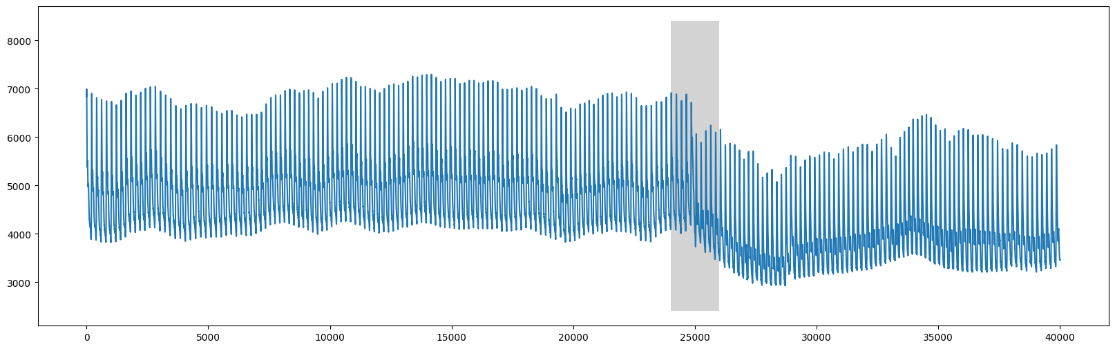
We can clearly see that there is a change around time=25000 that corresponds to when the table was tilted upright.
FLUSS#
Instead of using the full dataset, let’s zoom in and analyze the 2,500 data points directly before and after x=25000 (see Figure 5 in the paper).
start = 25000 - 2500
stop = 25000 + 2500
abp = df.iloc[start:stop, 1]
plt.plot(range(abp.shape[0]), abp)
plt.ylim(2800, 8500)
plt.axvline(x=2373, linestyle="dashed")
style="Simple, tail_width=0.5, head_width=6, head_length=8"
kw = dict(arrowstyle=style, color="k")
# regime 1
rect = Rectangle((55,2500), 225, 6000, facecolor='lightgrey')
plt.gca().add_patch(rect)
rect = Rectangle((470,2500), 225, 6000, facecolor='lightgrey')
plt.gca().add_patch(rect)
rect = Rectangle((880,2500), 225, 6000, facecolor='lightgrey')
plt.gca().add_patch(rect)
rect = Rectangle((1700,2500), 225, 6000, facecolor='lightgrey')
plt.gca().add_patch(rect)
arrow = FancyArrowPatch((75, 7000), (490, 7000), connectionstyle="arc3, rad=-.5", **kw)
plt.gca().add_patch(arrow)
arrow = FancyArrowPatch((495, 7000), (905, 7000), connectionstyle="arc3, rad=-.5", **kw)
plt.gca().add_patch(arrow)
arrow = FancyArrowPatch((905, 7000), (495, 7000), connectionstyle="arc3, rad=.5", **kw)
plt.gca().add_patch(arrow)
arrow = FancyArrowPatch((1735, 7100), (490, 7100), connectionstyle="arc3, rad=.5", **kw)
plt.gca().add_patch(arrow)
# regime 2
rect = Rectangle((2510,2500), 225, 6000, facecolor='moccasin')
plt.gca().add_patch(rect)
rect = Rectangle((2910,2500), 225, 6000, facecolor='moccasin')
plt.gca().add_patch(rect)
rect = Rectangle((3310,2500), 225, 6000, facecolor='moccasin')
plt.gca().add_patch(rect)
arrow = FancyArrowPatch((2540, 7000), (3340, 7000), connectionstyle="arc3, rad=-.5", **kw)
plt.gca().add_patch(arrow)
arrow = FancyArrowPatch((2960, 7000), (2540, 7000), connectionstyle="arc3, rad=.5", **kw)
plt.gca().add_patch(arrow)
arrow = FancyArrowPatch((3340, 7100), (3540, 7100), connectionstyle="arc3, rad=-.5", **kw)
plt.gca().add_patch(arrow)
plt.show()
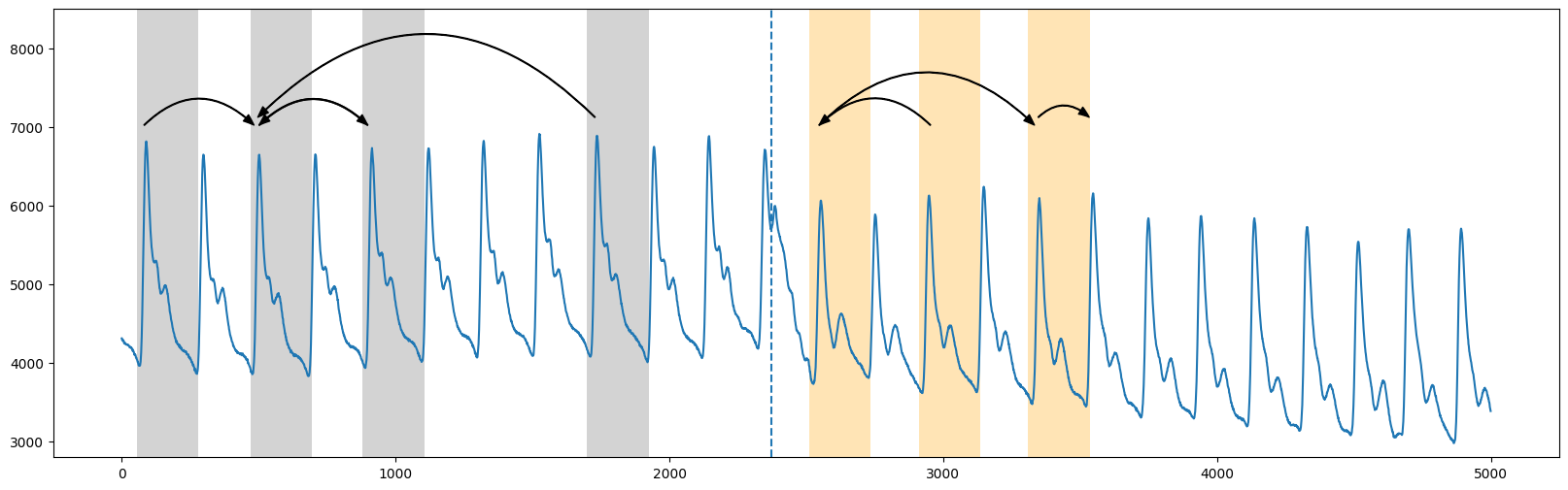
Roughly, in the truncated plot above, we see that the segmentation between the two regimes occurs around time=2373 (vertical dotted line) where the patterns from the first regime (grey) don’t cross over to the second regime (orange) (see Figure 2 in the original paper). And so the “arc curve” is calculated by sliding along the time series and simply counting the number of times other patterns have “crossed over” that specific time point (i.e., “arcs”). Essentially, this information can be extracted by looking at the matrix profile indices (which tells you where along the time series your nearest neighbor is). And so, we’d expect the arc counts to be high where repeated patterns are near each other and low where there are no crossing arcs.
Before we compute the “arc curve”, we’ll need to first compute the standard matrix profile and we can approximately see that the window size is about 210 data points (thanks to the knowledge of the subject matter/domain expert).
m = 210
mp = stumpy.stump(abp, m=m)
Now, to compute the “arc curve” and determine the location of the regime change, we can directly call the fluss function. However, note that fluss requires the following inputs:
the matrix profile indices
mp[:, 1](not the matrix profile distances)an appropriate subsequence length,
L(for convenience, we’ll just choose it to be equal to the window size,m=210)the number of regimes,
n_regimes, to search for (2 regions in this case)an exclusion factor,
excl_factor, to nullify the beginning and end of the arc curve (anywhere between 1-5 is reasonable according to the paper)
L = 210
cac, regime_locations = stumpy.fluss(mp[:, 1], L=L, n_regimes=2, excl_factor=1)
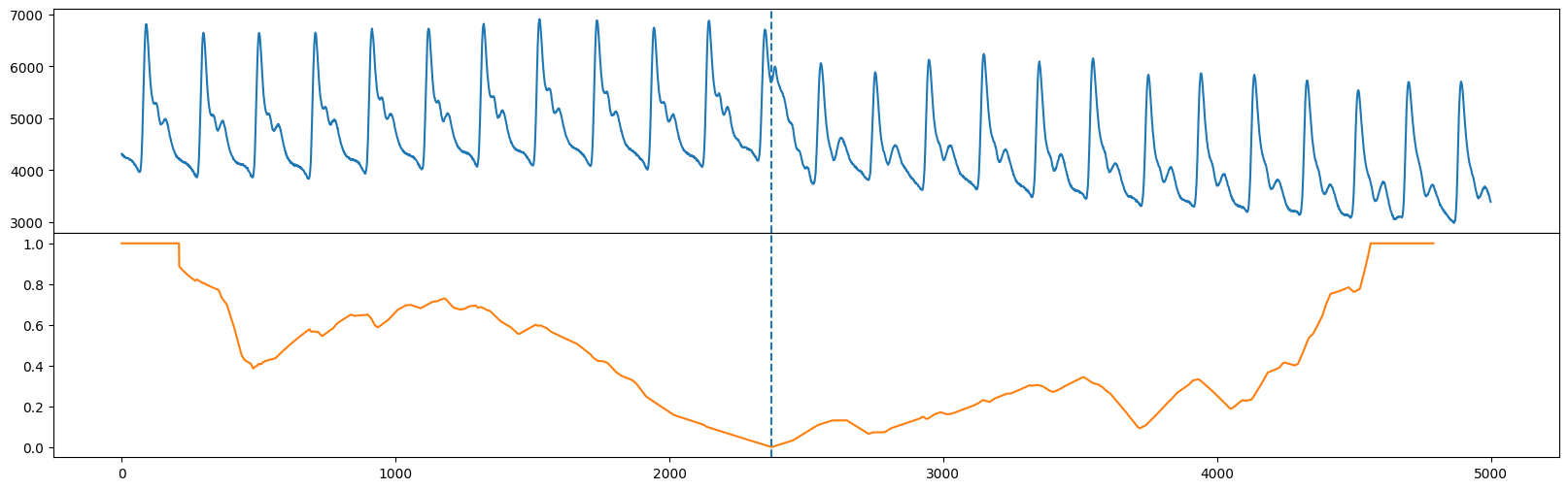
Notice that fluss actually returns something called the “corrected arc curve” (CAC), which normalizes the fact that there are typically less arcs crossing over a time point near the beginning and end of the time series and more potential for cross overs near the middle of the time series. Additionally, fluss returns the regimes or location(s) of the dotted line(s). Let’s plot our original time series (top) along with the corrected arc curve (orange) and the single regime (vertical dotted line).
fig, axs = plt.subplots(2, sharex=True, gridspec_kw={'hspace': 0})
axs[0].plot(range(abp.shape[0]), abp)
axs[0].axvline(x=regime_locations[0], linestyle="dashed")
axs[1].plot(range(cac.shape[0]), cac, color='C1')
axs[1].axvline(x=regime_locations[0], linestyle="dashed")
plt.show()
Added after STUMPY version 1.12.0
In place of array slicing (i.e., mp[:, 0], mp[:, 1]), the matrix profile distances can be accessed directly through the P_ attribute and the matrix profile indices can be accessed through the I_ attribute:
mp = stumpy.stump(T, m)
print(mp.P_, mp.I_) # print the matrix profile and the matrix profile indices
Additionally, the left and right matrix profile indices can also be accessed through the left_I_ and right_I_ attributes, respectively.
FLOSS#
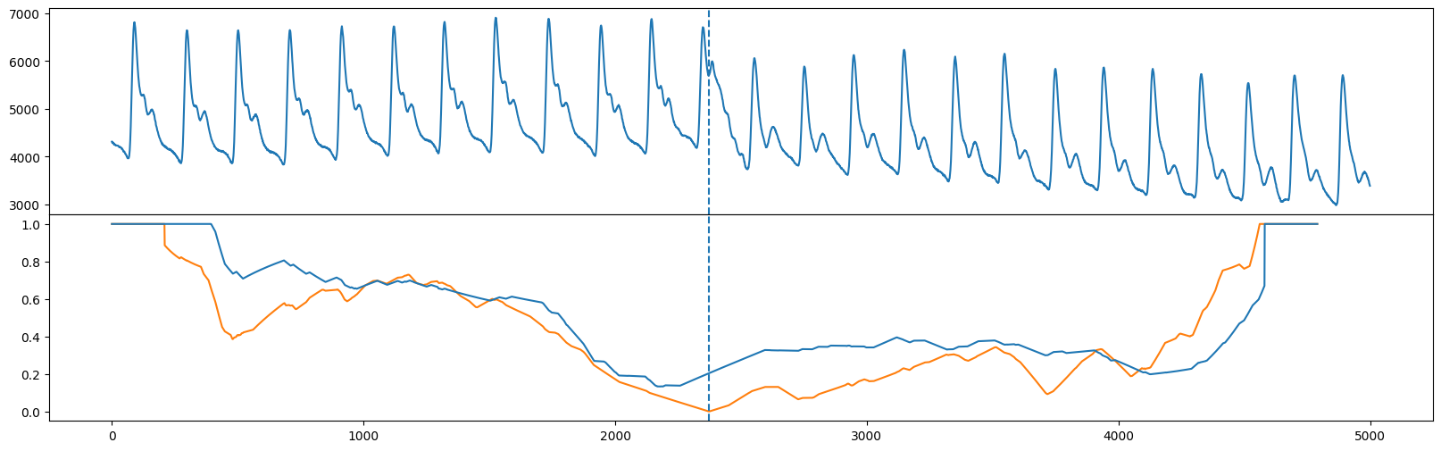
Unlike FLUSS, FLOSS is concerned with streaming data, and so it calculates a modified version of the corrected arc curve (CAC) that is strictly one-directional (CAC_1D) rather than bidirectional. That is, instead of expecting cross overs to be equally likely from both directions, we expect more cross overs to point toward the future (and less to point toward the past). So, we can manually compute the CAC_1D
cac_1d = _cac(mp[:, 3], L, bidirectional=False, excl_factor=1) # This is for demo purposes only. Use floss() below!
and compare the CAC_1D (blue) with the bidirectional CAC (orange) and we see that the global minimum are approximately in the same place (see Figure 10 in the original paper).
fig, axs = plt.subplots(2, sharex=True, gridspec_kw={'hspace': 0})
axs[0].plot(np.arange(abp.shape[0]), abp)
axs[0].axvline(x=regime_locations[0], linestyle="dashed")
axs[1].plot(range(cac.shape[0]), cac, color='C1')
axs[1].axvline(x=regime_locations[0], linestyle="dashed")
axs[1].plot(range(cac_1d.shape[0]), cac_1d)
plt.show()
Added after STUMPY version 1.12.0
In place of mp[:, 2] and mp[:, 3], you can access the left and right matrix profile indices through the left_I_ and right_I_ attributes, respectively:
mp = stumpy.stump(T, m)
print(mp.left_I_, mp.right_I_) # print the left and right matrix profile indices
Streaming Data with FLOSS#
Instead of manually computing CAC_1D like we did above on streaming data, we can actually call the floss function directly which instantiates a streaming object. To demonstrate the use of floss, let’s take some old_data and compute the matrix profile indices for it like we did above:
old_data = df.iloc[20000:20000+5000, 1].values # This is well before the regime change has occurred
mp = stumpy.stump(old_data, m=m)
Now, we could do what we did early and compute the bidirectional corrected arc curve but we’d like to see how the arc curve changes as a result of adding new data points. So, let’s define some new data that is to be streamed in:
new_data = df.iloc[25000:25000+5000, 1].values
Finally, we call the floss function to initialize a streaming object and pass in:
the matrix profile generated from the
old_data(only the indices are used)the old data used to generate the matrix profile in 1.
the matrix profile window size,
m=210the subsequence length,
L=210the exclusion factor
stream = stumpy.floss(mp, old_data, m=m, L=L, excl_factor=1)
You can now update the stream with a new data point, t, via the stream.update(t) function and this will slide your window over by one data point and it will automatically update:
the
CAC_1D(accessed via the.cac_1d_attribute)the matrix profile (accessed via the
.P_attribute)the matrix profile indices (accessed via the
.I_attribute)the sliding window of data used to produce the
CAC_1D(accessed via the.T_attribute - this should be the same size as the length of the `old_data)
Let’s continuously update our stream with the new_data one value at a time and store them in a list (you’ll see why in a second):
windows = []
for i, t in enumerate(new_data):
stream.update(t)
if i % 100 == 0:
windows.append((stream.T_, stream.cac_1d_))
Below, you can see an animation that changes as a result of updating the stream with new data. For reference, we’ve also plotted the CAC_1D (orange) that we manually generated from above for the stationary data. You’ll see that halfway through the animation, the regime change occurs and the updated CAC_1D (blue) will be perfectly aligned with the orange curve.
fig, axs = plt.subplots(2, sharex=True, gridspec_kw={'hspace': 0})
axs[0].set_xlim((0, mp.shape[0]))
axs[0].set_ylim((-0.1, max(np.max(old_data), np.max(new_data))))
axs[1].set_xlim((0, mp.shape[0]))
axs[1].set_ylim((-0.1, 1.1))
lines = []
for ax in axs:
line, = ax.plot([], [], lw=2)
lines.append(line)
line, = axs[1].plot([], [], lw=2)
lines.append(line)
def init():
for line in lines:
line.set_data([], [])
return lines
def animate(window):
data_out, cac_out = window
for line, data in zip(lines, [data_out, cac_out, cac_1d]):
line.set_data(np.arange(data.shape[0]), data)
return lines
anim = animation.FuncAnimation(fig, animate, init_func=init,
frames=windows, interval=100,
blit=True)
anim_out = anim.to_jshtml()
plt.close() # Prevents duplicate image from displaying
if os.path.exists("None0000000.png"):
os.remove("None0000000.png") # Delete rogue temp file
HTML(anim_out)
# anim.save('/tmp/semantic.mp4')
Summary#
And that’s it! You’ve just learned the basics of how to identify segments within your data using the matrix profile indices and leveraging fluss and floss.